Sharing + Kang + Design
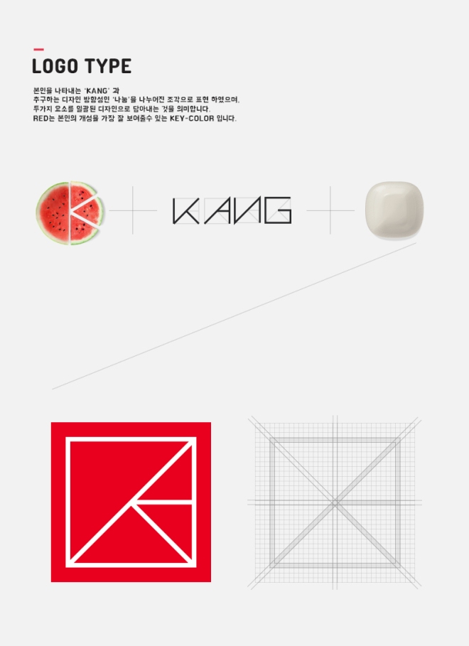
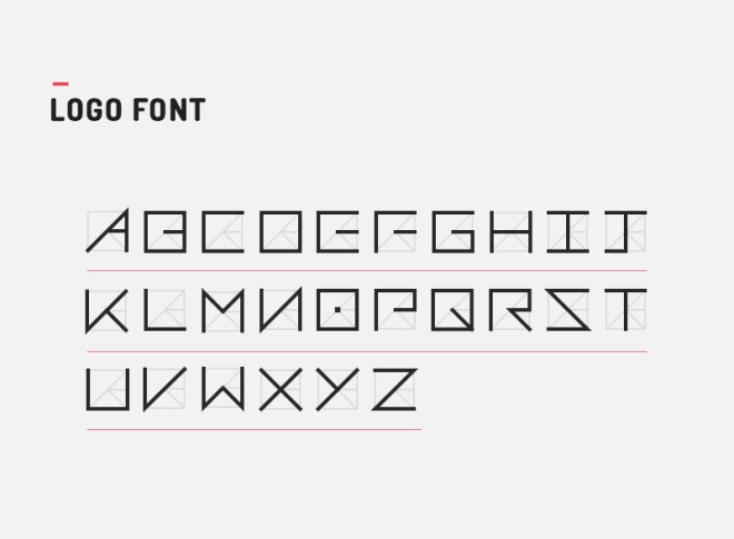
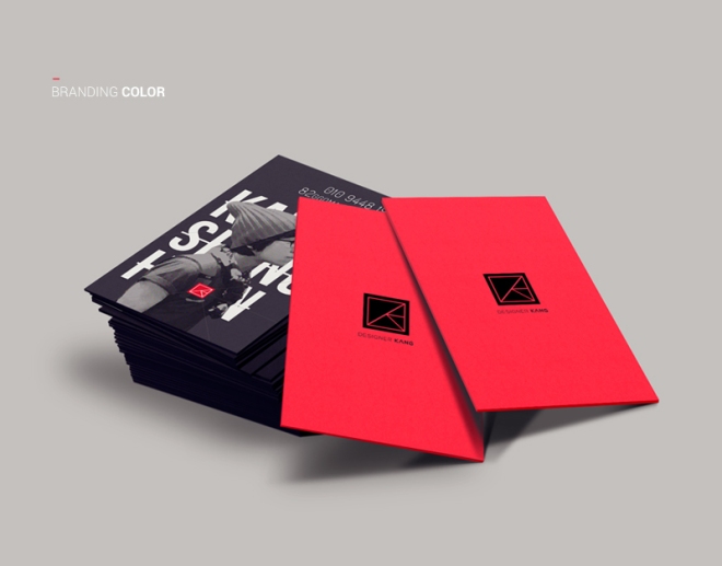
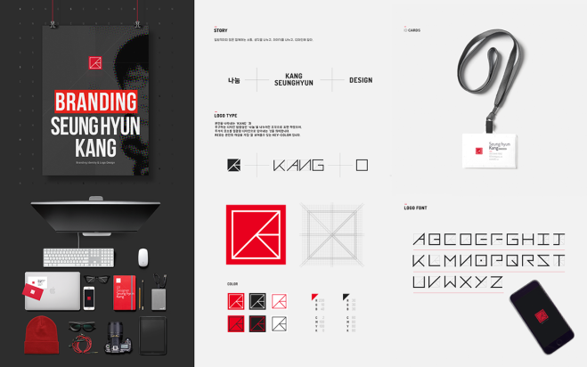
Sometimes it is better to think inside the box. “Think inside the box” in this context, is not about someone whose method of creativity is limited. In fact, we are referring to what inspires our Creative Pick from South Korea, Seunghyun Kang‘s personal branding project. For the personal logo, Seunghyun conceived this principal of “Sharing + Kang + Design” which is cleverly packaged in a square or box. Looking carefully in this box, are lines to express “sharing of design ideas”. And “K” which is an alphabet found in the name “Kang” represents the personal brand and brain behind this design. The lines in this boxed space are to support multilateral communication where thoughts, ideas and expressions all fit in this same space. Lastly, a bold dash of red color is applied to highlight Seunghyun’s passion for design and sharing.
A simple idea – look, how brilliantly it works for this branding exercise! Next time, if you are working on your own design project, do not be afraid to think inside a box. It may yield the better solution than thinking out of the box.
Take a peek at Seunghyun’s elaborate details of the logo design, branding development, cool applications, the lot!


Loving the red-hot logo by Seunghyun? Catch more of Seunghyun’s hot designs on Website, Behance, Twitter, Dribble and Facebook

Thank you for the interest of my design works.
LikeLike
Seungh-hyun, you are most welcome!
LikeLike